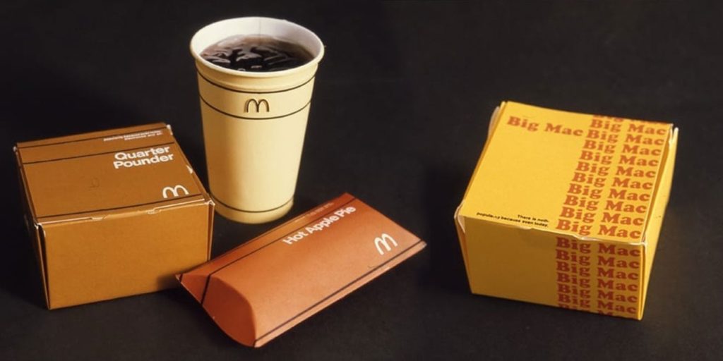
It’s hard to imagine McDonald’s without its signature yellow and red. The golden arches—in #FFC20F for you RGB nerds—have stood the test of time and are an iconic institution around the world.
But what if the brand had a groovy ’70s vibe?
It very well could have happened but for a sensible brand manager (likely wearing very wide collars) who rejected some designs and prototypes by Unimark International in 1973.
Let’s just say that the design certainly did reflect the times with some groovy typefaces and a generally brown motif and some other color pops that would have been better served in an episode of the Mary Tyler Moore Show.
“Most packaging in that era reflects the freedom of the time. It’s colorful and psychedelic or has a mod pattern,” said Douglas Q. Davis, chair of the B.F.A. in communication design at CUNY in Brooklyn. “This observation could also explain what the brand wanted to convey about its product attributes, interpreted through the lens of the package designers who probably come from the upper-middle-class homes they wanted to reach. I am a product of the ’70s and came from a different frame of reference and, to me, this brown cardboard, standard issue burger, coffee and apple pie was the ‘government cheese’ concept for McDonald’s.”
The work was unearthed by the Vignelli Center for Design Studies at Rochester Institute of Technology—which was digitizing Unimark International’s records—and shared on its Instagram page.
According to the post, the Chicago design firm (which, best known for its enduring work for the New York City Transit Authority, filed for bankruptcy in 1977) went deep with McDonald’s employees, managers and customers to get an idea of which direction to go. There was particular emphasis on packaging and more unified, consistent look.
An additional bump came from Pentagram’s Michael Bierut, who tossed the work up on Twitter.
It’s always a fun exercise to see some of the histories of legendary brands … and what could have been. Thankfully, this one didn’t quite make it to the finish line, because it’s hard to believe that the design could have stood the test of time. Yet it is interesting to see that there may have been some inadvertent inspiration from the designs on some of today’s McDonald’s packaging.

