
Google changes ads to make them look less like ads – Input Magazine
|
Getting your Trinity Audio player ready...
|
SOURCE: Evan Rodgers | Input Magazine
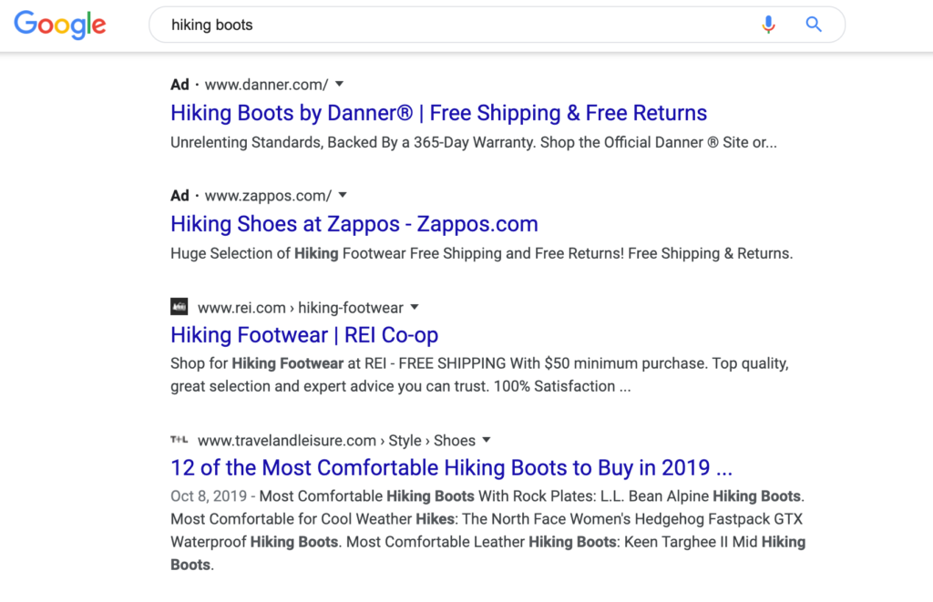
You may not have noticed, but on January 13th Google made a subtle visual change to search on desktop. Organic search results now have a small favicon in the top left, and ads now have a small bit of text that says “Ad” in the same spot. The text is bold but small, and seems conspicuously placed to provide as little visual distinction as possible between what’s an ad and what isn’t.
Obviously we can’t know whether it’s Google’s intent to make its ads less differentiated to confuse users into clicking on them, but a visual history of Google Search from SearchEngineLand shows a clear pattern: over the years Google has moved from clearly identifiable colored backgrounds to colored accents, to what is now a tiny, monochromatic label.
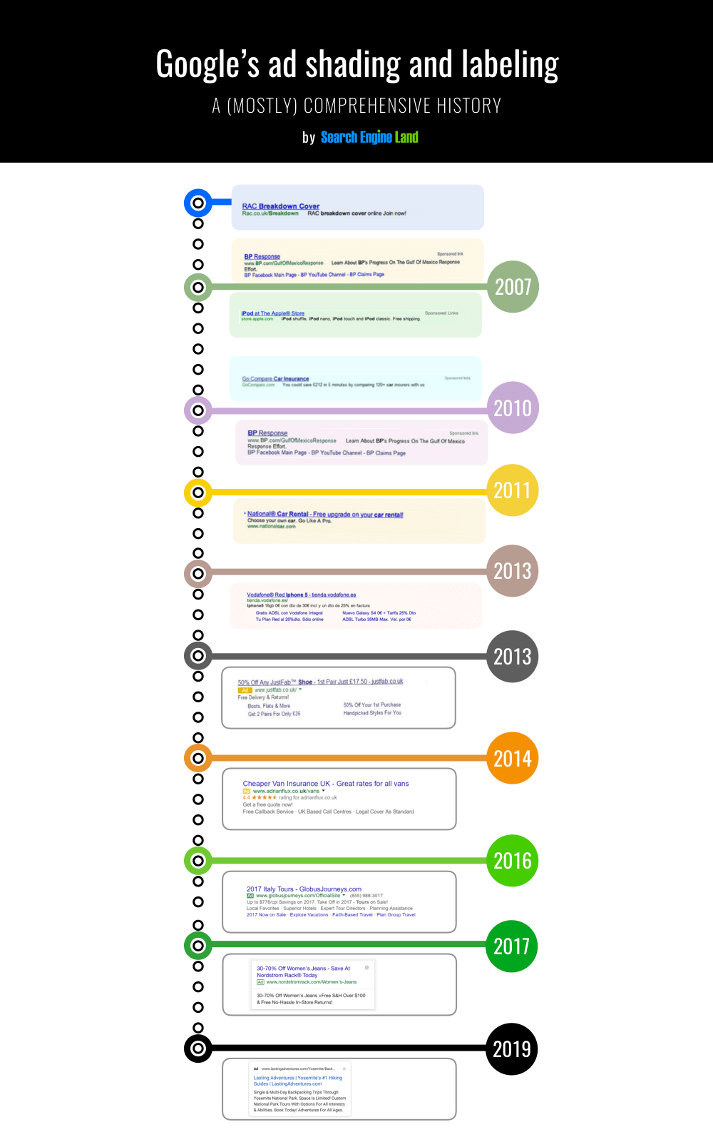
SOURCE: SearchEngineLand
On its blog post about the change, Google says “this new design allows us to add more action buttons and helpful previews to search results cards, all while giving you a better sense of the web page’s content with clear attribution back to the source,” but doesn’t explain why this had to happen at the expense of colored labeling.
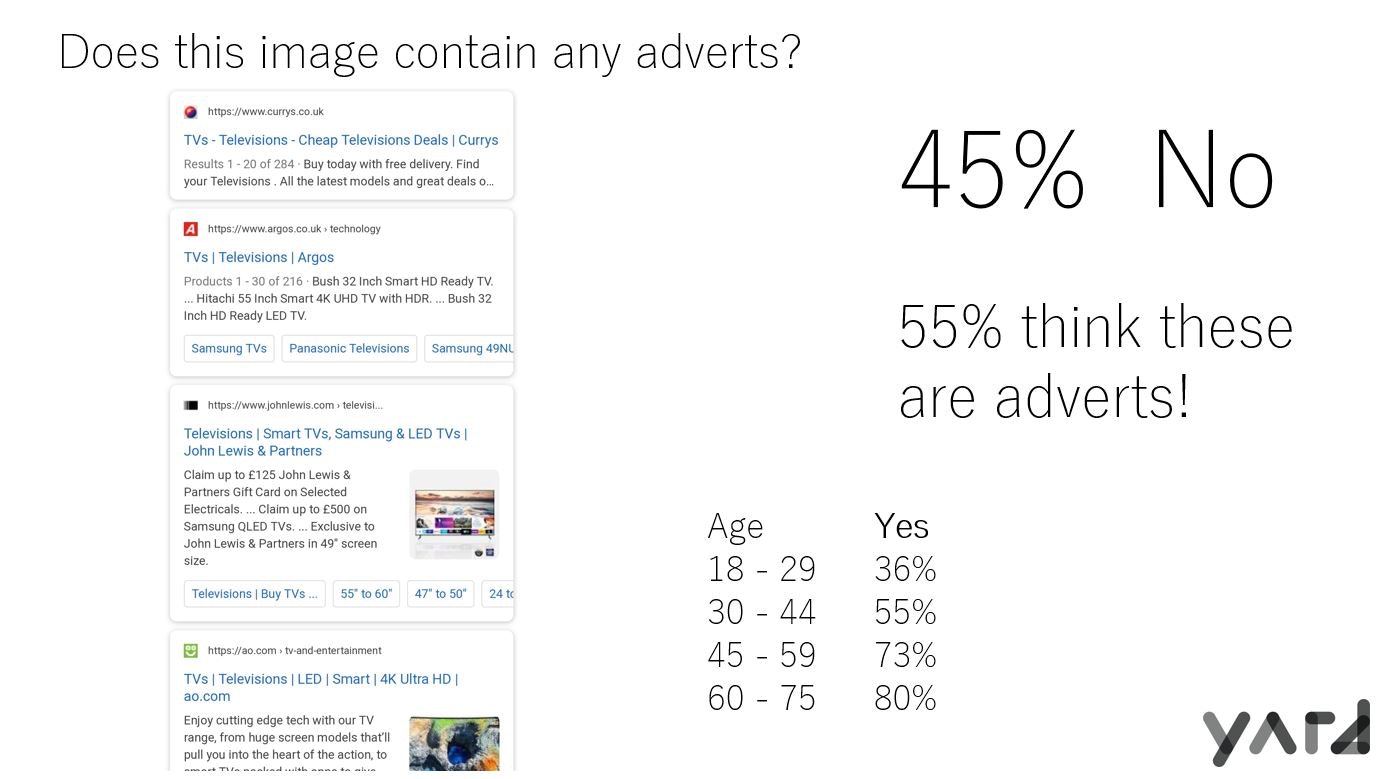
Interestingly, a marketing firm named Yard did some user testing on this design change after it first landed on mobile back in 2019 and found that users actually misidentify the new organic favicon results as ads slightly more often (shown below). The Yard study links to a number of other studies on whether users can tell when they’re seeing ads and the results aren’t great: the latest one from Varn found that “only 40 percent of people know which links on Google are paid adverts.”